Elevate Design for Pure Luxe
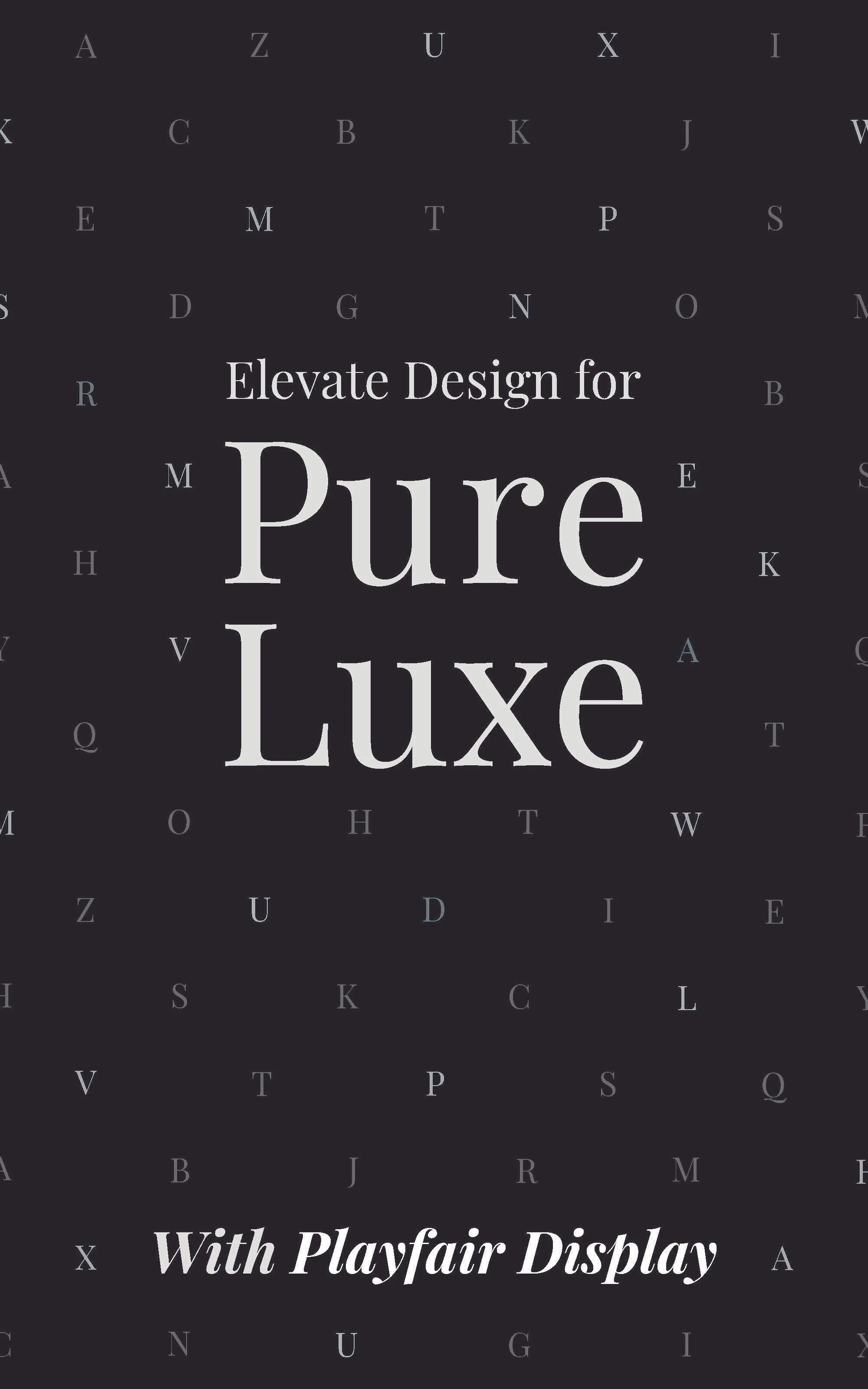
Elevate Design for Pure Lux is a compelling influential design to persuade designers to incorporate the Playfair Display typeface into their work. The composition is meticulously structured, ensuring a sense of balance and elegance. At the heart of the design, the words Pure Luxe are carefully stacked and aligned, creating a visually harmonious structure where the “P” and “L” set the outer framework, while the “U” and “E” create a natural balance within the center and sense of repetition. Positioned just above, the phrase Elevate Design For fits seamlessly between the beginning and end of "Pure," reinforcing a refined sense of order and intentional placement.
Beyond its textual message, the design also serves as an artistic showcase of Playfair Display, presenting an entire alphabet array in a creative and captivating manner. The letters appear in a dynamic arrangement, evoking the feel of luxury branding seen in Louis Vuitton and other designer patterns. The interplay of darker and lighter gray tones throughout the alphabet adds a twinkling effect enhancing the visual sophistication of the composition.
At the bottom center, the phrase With Playfair Display is rendered in bold italic, ensuring it captures attention while guiding the viewer’s eye smoothly across the composition. The phrase Elevate Design for Pure Luxe embodies the essence of luxury, structure, and sophistication, making Playfair Display feel both elegant and timeless. The combination of Pure Luxe, meaning pure luxury, is reinforced through both the typographic choices and the detailed layout, successfully persuading designers to embrace the typeface for high-end, refined designs.
