
In a Jiffy
In a Jiffy is a nationwide delivery service dedicated to providing fast and efficient doorstep deliveries for elderly individuals. Whether it’s groceries, medical equipment, heavy goods, or everyday essentials, the company ensures that customers receive what they need without the inconvenience of leaving their homes. While speed and reliability are core to the brand, In a Jiffy also prioritizes a warm, personal experience, ensuring that every delivery feels like a thoughtful interaction designed to bring convenience and care to its customers.

Logo & Stationery
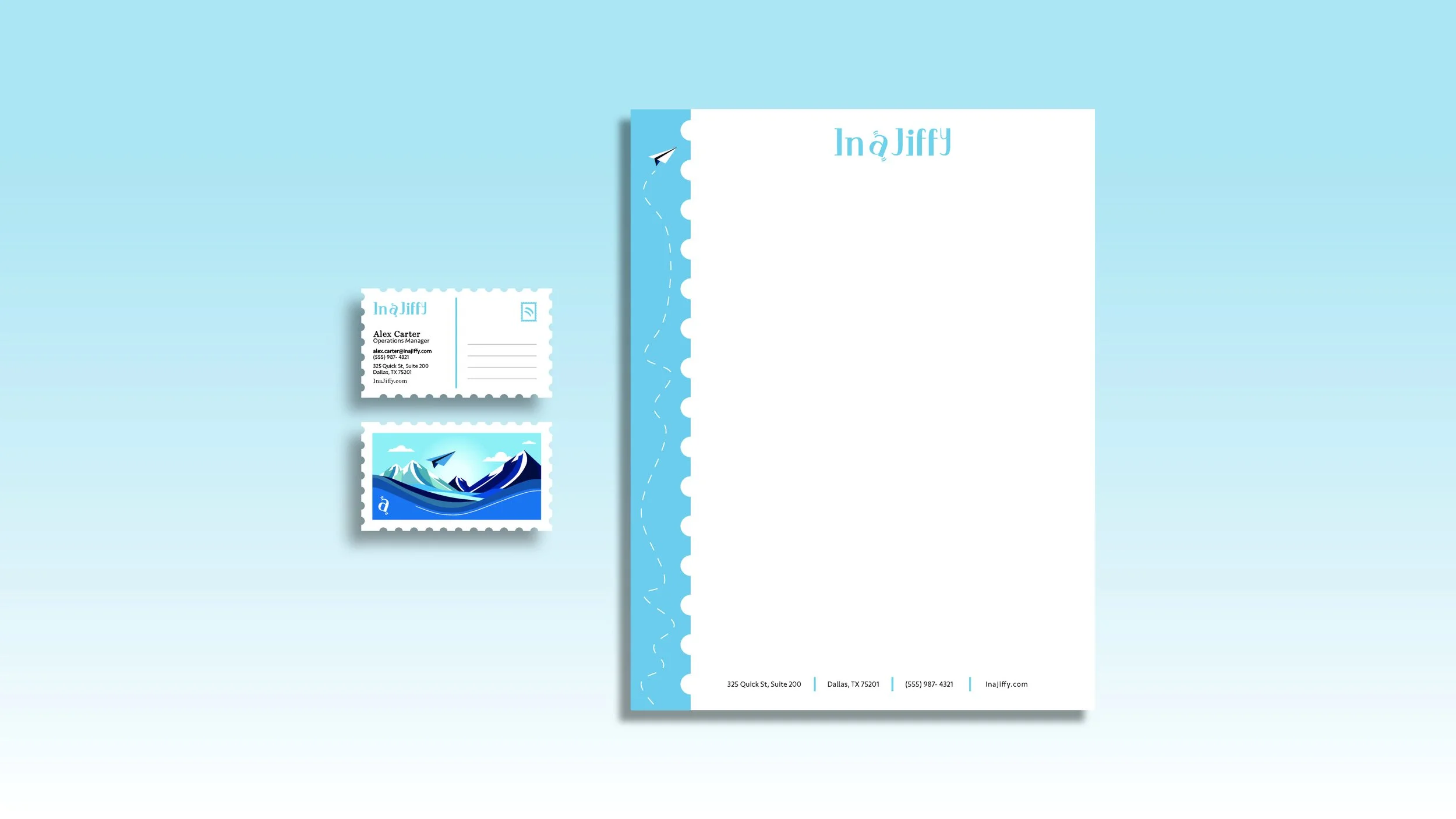
The In a Jiffy logo is crafted using a serif typeface to enhance legibility for elderly individuals, ensuring that the name is clear and easy to read. The subtle shift in x-height introduces a slight disruption in the text, adding a playful and unique character to the design. This small yet intentional detail reflects the brand’s personality efficient yet approachable. The muted blue color was thoughtfully chosen to evoke a vintage aesthetic, creating a sense of familiarity and trust. Looking closely at the letter "a," you’ll notice a slight tilt, reinforcing the theme of movement and speed. The added accent lines within the design symbolize motion, referencing both the jumbling of packages during transit and the rhythmic shake of an alarm clock, visually reinforcing the idea that deliveries are made “in a jiffy.”
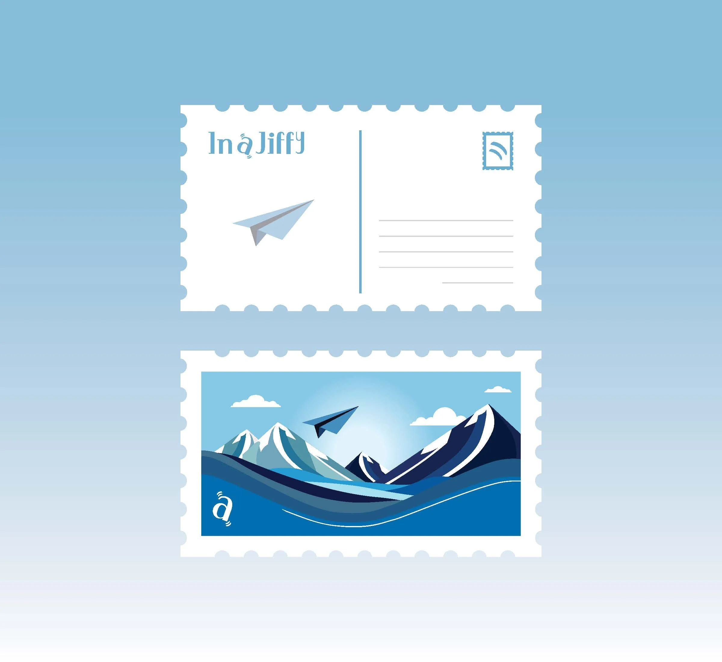
The stationery design follows this same thoughtful approach, drawing inspiration from postcards to emphasize the company’s ability to deliver across various locations. The front of the postcard style stationery features a landscape illustration, representing the vast areas the company reaches. A paper plane soars above mountains, symbolizing how no obstacle is too great for In a Jiffy to ensure timely and efficient deliveries. The business card is designed with clear organizational sections for essential contact information, while a light gray lined area mimics the space for a handwritten note or delivery status update, adding a personal touch to the service. The stamp marking in the top right corner subtly echoes the logo’s movement, naturally drawing the eye across the design. Finally, the letterhead incorporates a dashed-line flight path following an airplane, visually reinforcing the idea that In a Jiffy is always in motion, delivering with both speed and care with a subtle postcard border.
Stationery Extension | Postcard
As an extension of the In a Jiffy stationery, the postcard reinforces the brand’s originality while maintaining consistency with the business card structure. It incorporates many of the same visual elements, ensuring a seamless connection between all brand materials. The front of the postcard features a dynamic landscape composition, depicting mountains, valleys, and flowing water to symbolize the brand’s ability to overcome any obstacle in ensuring deliveries arrive safely and on time.
On the back of the postcard, there is a designated writing area, designed as a thoughtful extension of the brand’s mission. Because In a Jiffy serves elderly individuals, the postcard serves as an opportunity for their children or grandchildren to write personal notes that can be delivered alongside their package. This detail adds a warm, sentimental touch to the service, making deliveries feel more personal and meaningful. The paper plane illustration on the back is subtly adjusted in opacity to create a layered effect, allowing the written message to remain the primary focus while still maintaining a visual connection to the brand’s theme of movement and care. This design choice enhances the emotional and functional value of the postcard as it becomes a way for families to stay connected, no matter the distance.